Direct
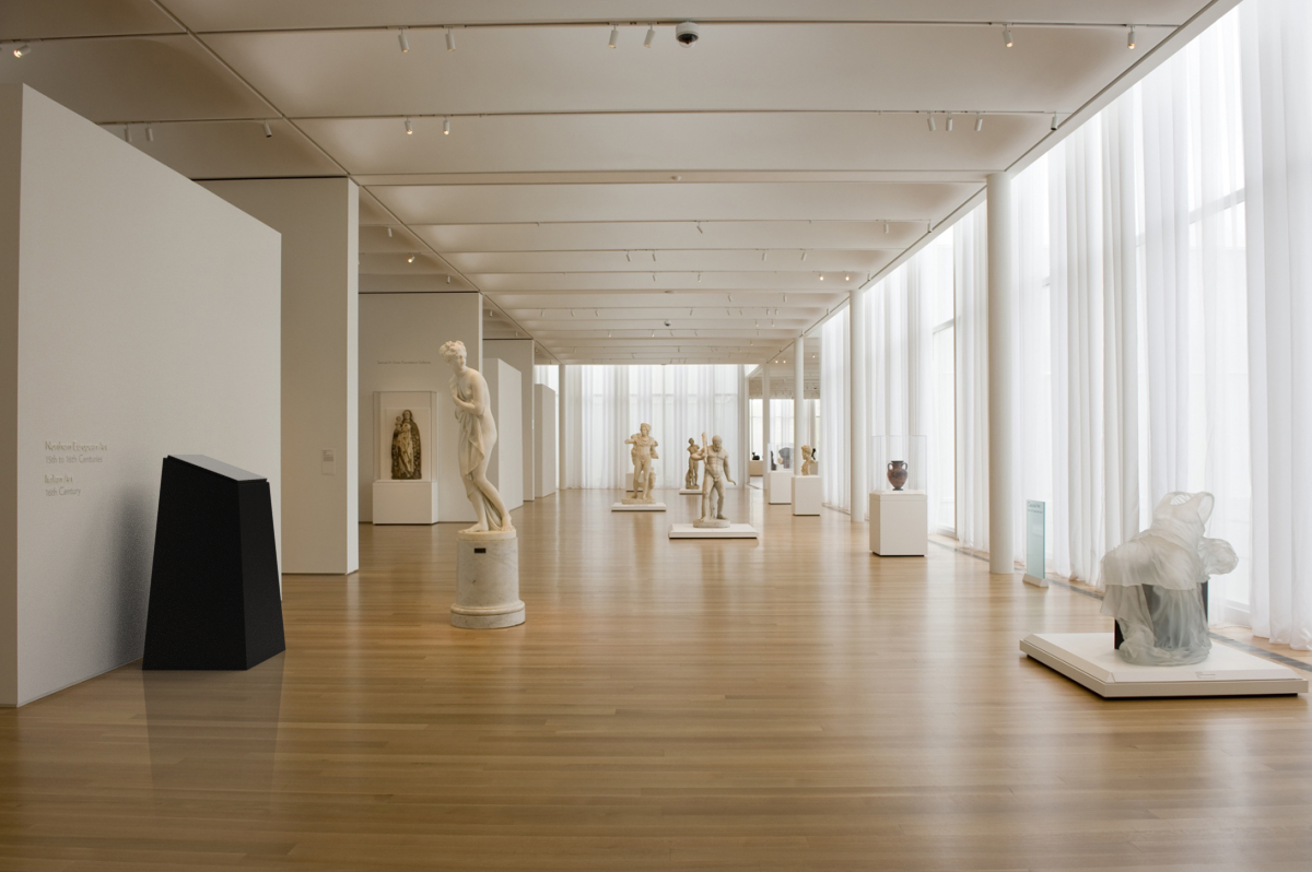
Direct is an accessibility design project for the NC Museum of Art. Our team of four design students researched the space and created digital and physical solutions to enhance wayfinding for low-vision users.

Research
In a group of four design students, I interviewed museum employees and stakeholders to find pain points and areas of interest for an accessibility intervention. Low-vision users are often not considered in visual arts spaces, leading us to take our findings and synthesize them into a user journey map through the NCMA.

Mobile Solution
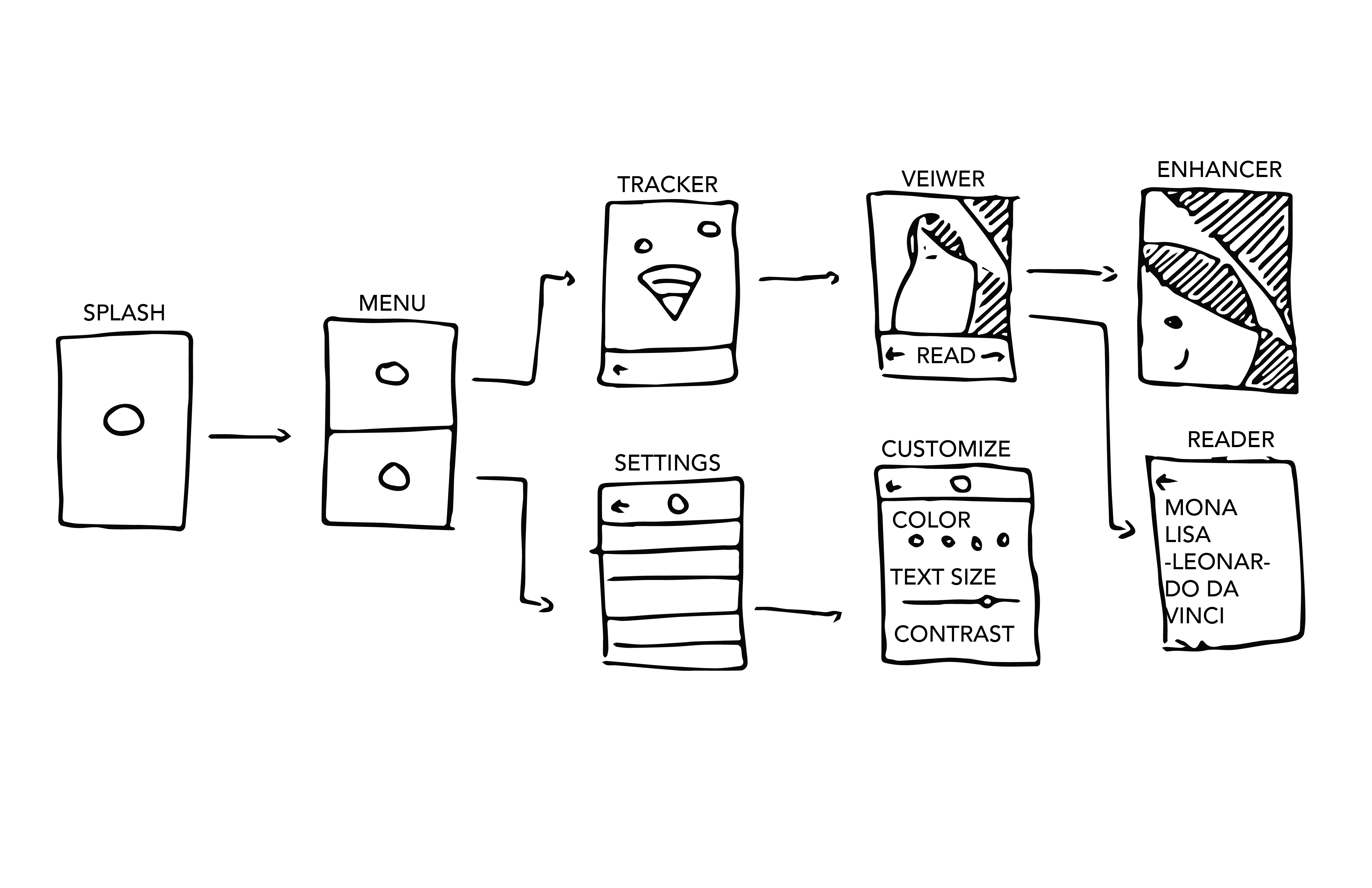
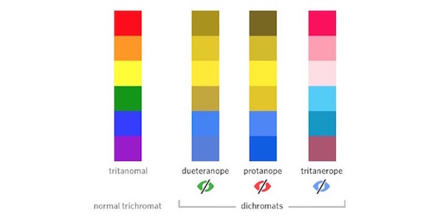
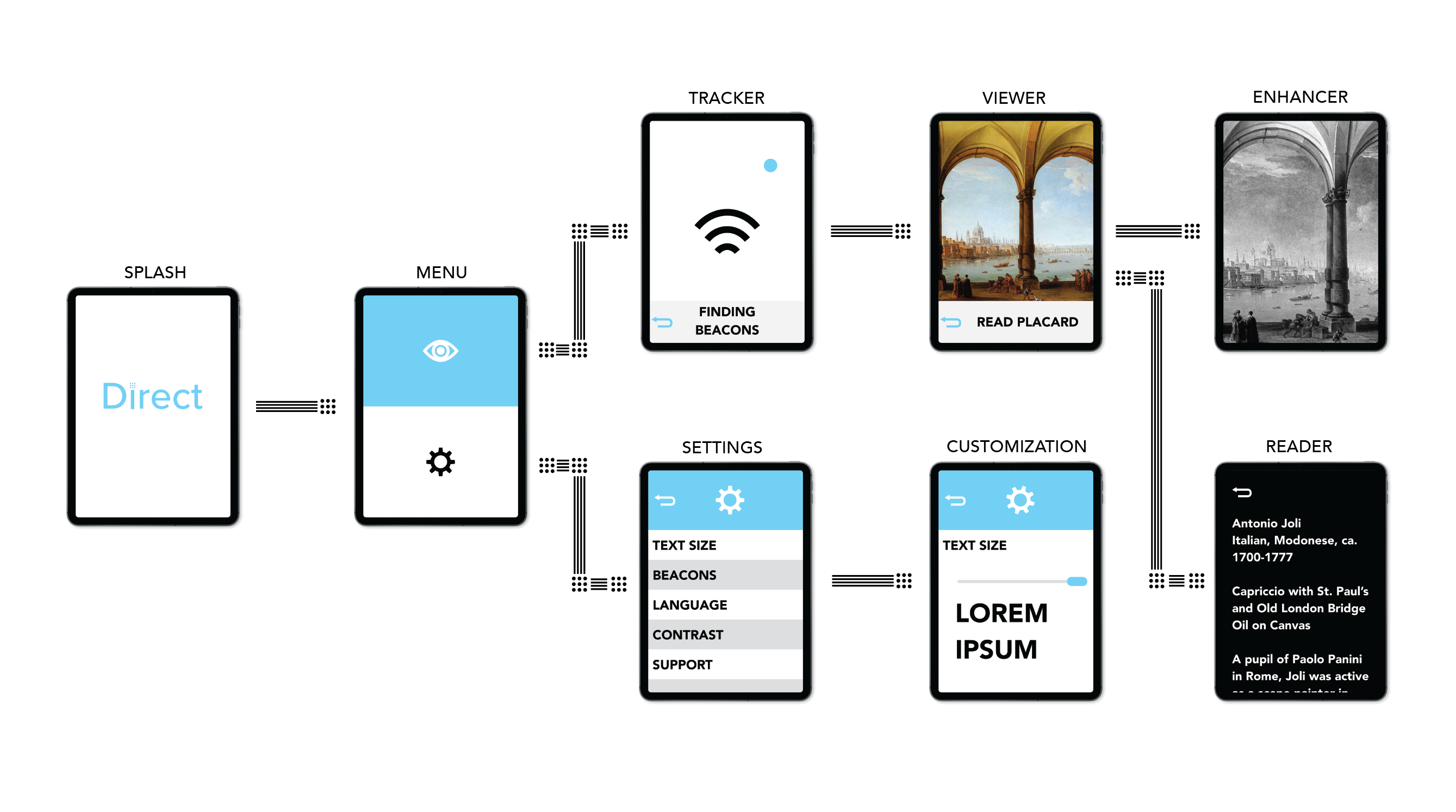
To create a comprehensive user experience, we addressed certain wayfinding and viewing needs with a mobile app. This app, on a tablet, would have information and high-resolution scans of nearby exhibits. Research supported the addition of colorblindness toggles and contrast sliders to customize the visual design. Cyan was used across the UX design and brand design because it appears as consistently blue across most ranges of visual impairment.
Wayfinding
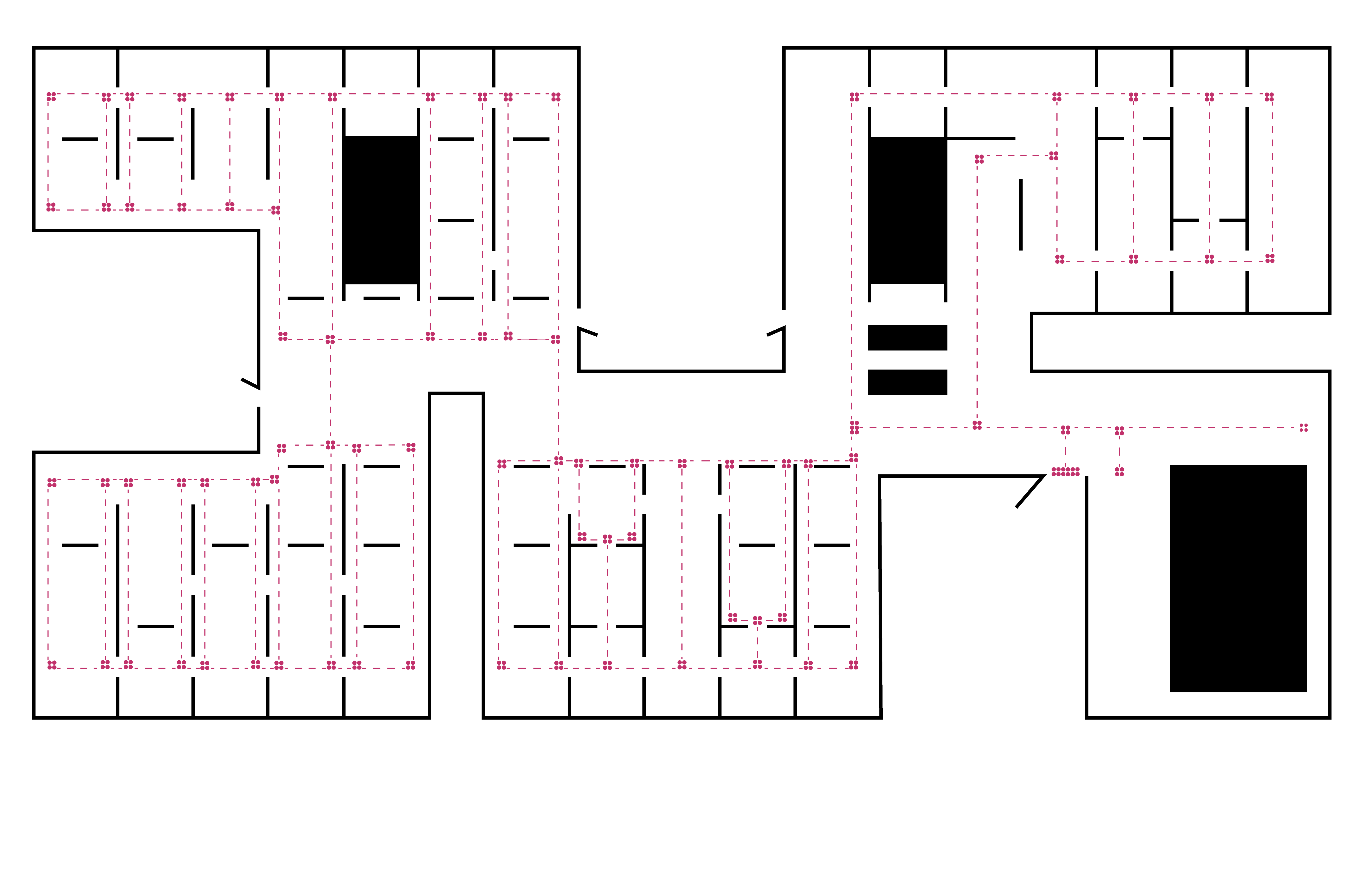
The map to the left is an idealized map of the
NCMA with textured floor paneling creating a
guide through the museum.
This map could be printed with the black lines (walls), blue lines (pathways) and blue dots (stopping points and intersections) embossed to create a textured map that one could run their finger along and memorize a general layout of the space.
![]()
This map could be printed with the black lines (walls), blue lines (pathways) and blue dots (stopping points and intersections) embossed to create a textured map that one could run their finger along and memorize a general layout of the space.

